Jaguar has had a major design overhaul, however, not everyone is happy about it.
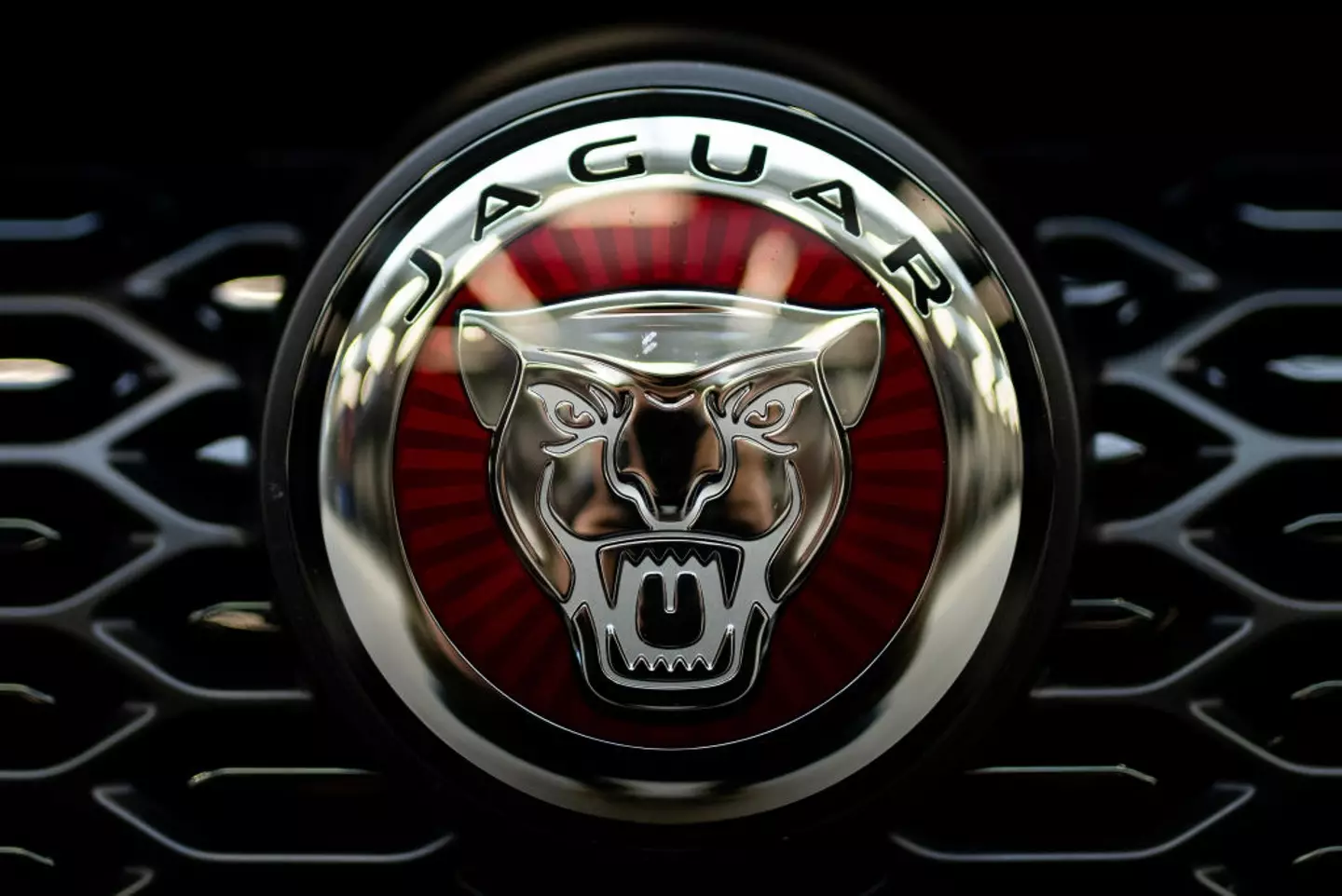
While most of us associate the Jaguar logo with the iconic large cat, leaping into mid-air, it now looks totally different.
The car manufacturer, which was founded in 1922, unveiled its new logo on Tuesday (19 November) with a complete overhaul of its social media platforms.

Jaguar is having a rebrand (Mateusz Slodkowski/SOPA Images/LightRocket via Getty Images)
The vibrant rebrand video showed a number of models in brightly colored outfits, alongside the caption: “Copy nothing.”
Throughout the ad, phrases such as ‘create exuberant’, ‘live vivid’, ‘delete ordinary’, and ‘break moulds’ pop up on screen.
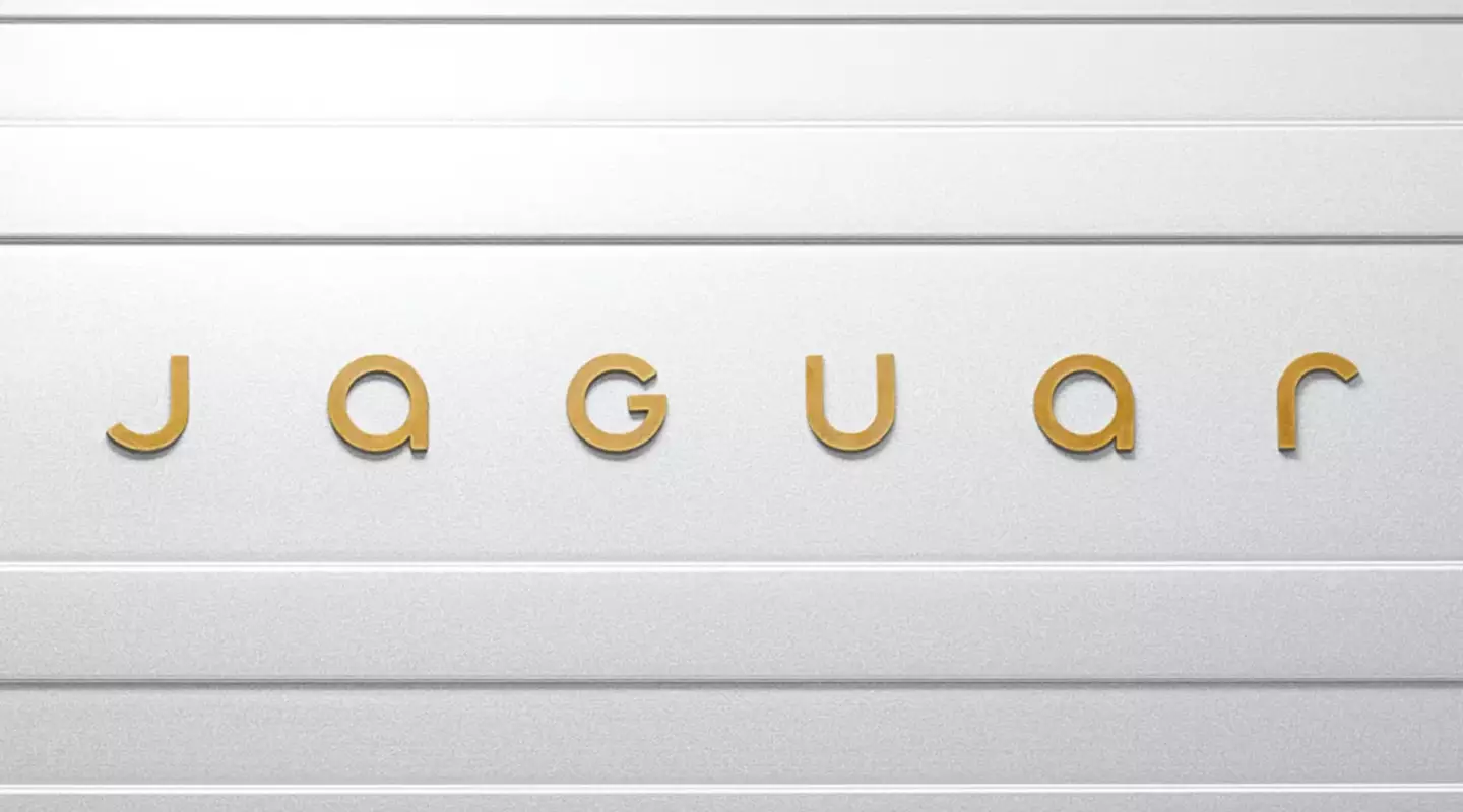
The brand’s new logo is now written as JaGUar to ‘ seamlessly blended upper and lower case characters in visual harmony’, the car company said as per The Independent, with the big cat noticeably missing. The iconic growler badge has also been replaced with a monogram of the J and R.
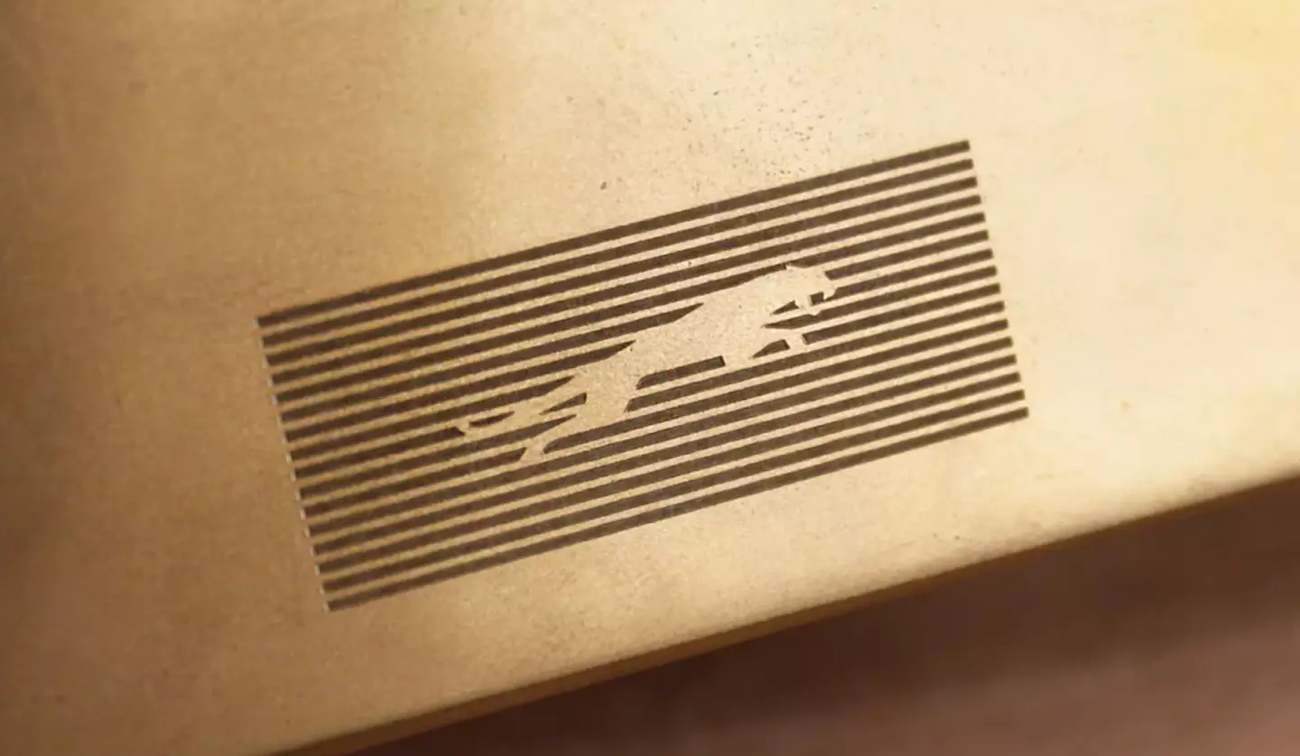
The jaguar will be retained, however, but it will be used on a new lined background instead – which the company calls ‘strikethrough’.
But people have been left baffled by the redesign.
One person was even concerned that the company’s accounts had been supposedly hacked, writing: “Is this account hacked or something? What happened to prestige? Pace? Luxury? What is all this?”
Another said: “I’ve been a brand designer for 30 years and rarely have I seen such an ill-conceived new graphic ident. This will be taught in design classes for decades as a prime example of what not to do.”
While a third wrote: “Wow. Really gets me in the mood for buying a car.”
“I need to know how many meetings went into making this,” added a fourth.
However, bosses have said there’s ‘no Plan B’ to the rebrand, explaining the firm has to be ‘fearless’.

Fans aren’t loving the redesign (Jaguar)
“Exuberant use of color is a cornerstone of Jaguar’s new brand identity, embedded in its values and its association with art,” the car company said.
“Primary colors, born from the painter’s palette – yellow, red and blue – are the tonal building blocks, always presented with texture or movement.”
Meanwhile, chief creative officer Gerry McGovern added: “Jaguar has its roots in originality. Sir William Lyons, our founder, believed that ‘a Jaguar should be a copy of nothing’.
“Our vision for Jaguar today is informed by this philosophy. New Jaguar is a brand built around Exuberant Modernism.
“It is imaginative, bold and artistic at every touchpoint. It is unique and fearless.

The leaping jaguar will remain (Jaguar)
“We are creating Jaguar for the future, restoring its status as a brand that enriches the lives of our clients and the Jaguar community.”
According to The Independent, Jaguar also took their new cars off sale more than a year ago ahead of the change – which managing director, Rawdon Glover, says was ‘intentional’ to create a separation between the old and new models as the brand looks to become fully electric.
He added: “We need to change people’s perceptions of what Jaguar stands for. And that’s not a straightforward, easy thing to do. So having a fire break in between old and new is, actually, very helpful.”
UNILAD has reached out to Jaguar for comment.
Featured Image Credit: Artur Widak/NurPhoto via Getty Images / KENZO TRIBOUILLARD/AFP via Getty Images


