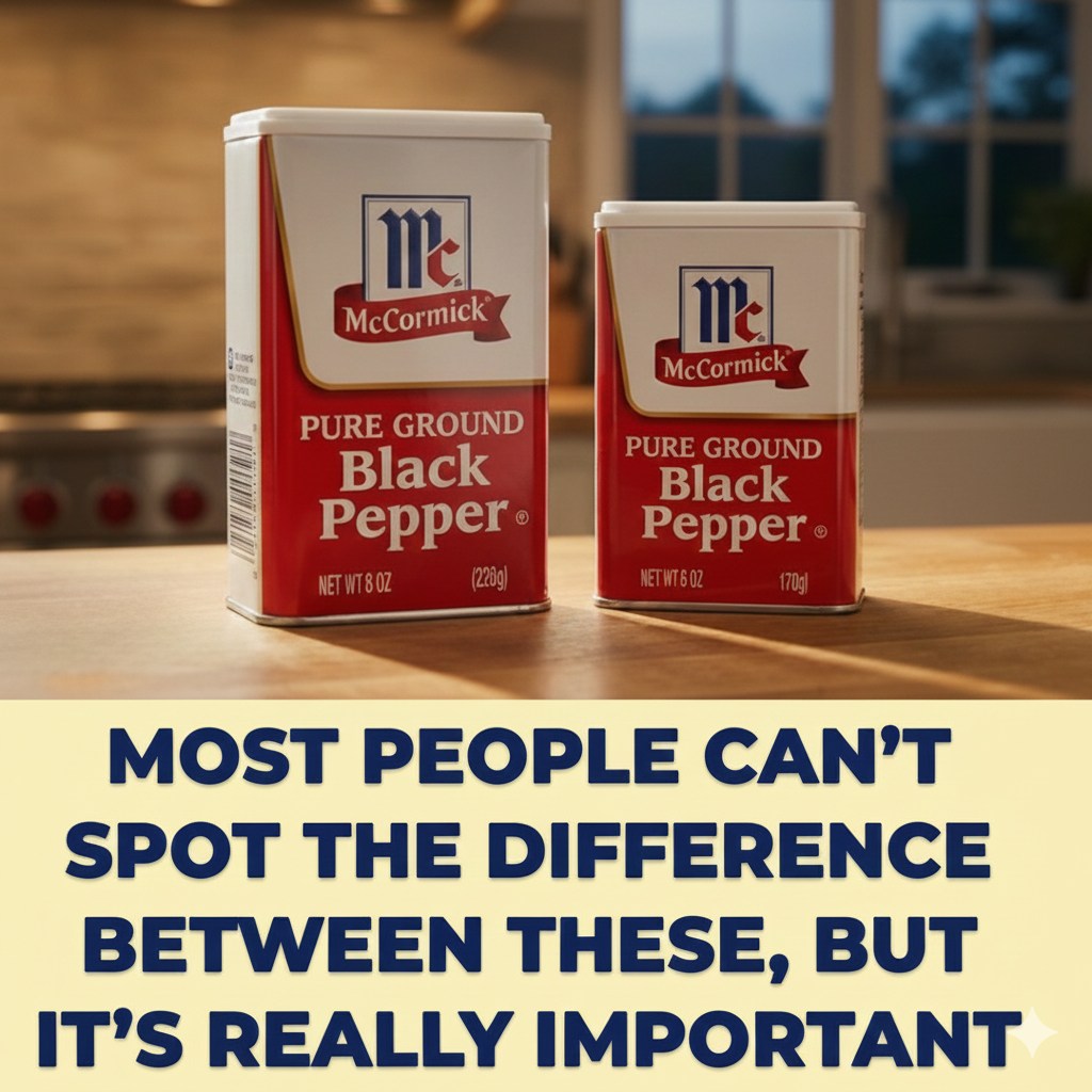
What began as a technical dispute over ounces has steadily transformed into a broader debate about trust, perception, and transparency in the grocery aisle. At the center of the controversy is McCormick, a household name that insists its spice labels are accurate, legal, and fully compliant with federal regulations. The company points to clearly printed net weights on every container as proof that nothing is hidden from consumers. By the letter of the law, McCormick argues, shoppers are given all the information they need to make informed choices.
Watkins, however, sees the issue differently. The company contends that what shoppers notice first is not the fine print at the bottom of a label, but the size, shape, and overall presence of the container itself. Those visual cues, they argue, create powerful expectations. A taller bottle or a wider jar suggests abundance, even before a single word is read. When the actual contents do not match that perceived promise, Watkins claims the consumer experience shifts from confidence to quiet disappointment.
As federal reviews move slowly forward, what once seemed like a narrow disagreement over packaging standards has become something much larger. The case now speaks to a growing unease about how modern products are marketed. In crowded supermarket aisles lined with nearly identical options, visual design often becomes the deciding factor. Subtle differences in height, spacing, and opacity can influence purchasing decisions just as much as brand reputation or price.
Consumer advocates have pointed out that this case highlights a persistent tension between legality and trust. A label can meet every regulatory requirement and still leave customers feeling misled. When perception suggests more than reality delivers, shoppers are left questioning not just one product, but the integrity of the brands behind it. This erosion of confidence can ripple outward, shaping how people approach the entire category of goods.
Packaging experts note that design has always carried psychological weight. Humans naturally associate larger containers with greater value, even when the printed measurements say otherwise. This instinct is not new, but modern branding has learned how to refine it with remarkable precision. Colors, proportions, and even the placement of text are carefully engineered to guide the eye and frame expectations in seconds. In that context, the argument that visuals carry their own promise feels especially compelling.
Whatever the legal outcome, the case is already reshaping conversations inside corporate boardrooms. Marketing teams are being asked not only whether their designs are compliant, but whether they are fair. Legal departments are being pushed to think beyond what is technically permissible and to consider how products are actually experienced by real people moving quickly through store aisles.
For shoppers, the dispute has sparked renewed attention to details that often go unnoticed. More people are checking net weights, comparing package sizes, and questioning why two containers of similar size can hold noticeably different amounts. This shift in behavior reflects a deeper awareness that presentation and substance do not always align.
Ultimately, the case raises uncomfortable questions about how often packaging is designed to suggest more while delivering less, and whether adherence to regulations is enough when perception tells a different story. Trust, once shaken, is difficult to rebuild. Companies may win legal arguments and still lose customer loyalty if shoppers feel their expectations have been quietly manipulated.
In a market crowded with choices, brands are being forced to confront a hard truth. The real ingredient that keeps customers coming back is not clever design or technical compliance alone. It is simple, unambiguous honesty. When people believe a brand respects them, they return. When they feel misled, even subtly, they remember. And in an age when word travels fast and skepticism runs deep, that memory can shape buying habits for years to come.